

Best Data Visualization Techniques

Practical data understanding hinges on the ability to decipher complex information through visualization. For managers, it’s a must to know data visualization techniques. Data scientists and analysts can also use data visualization methods to pinpoint crucial patterns and data points, find answers to questions, and improve problem-solving.
This article looks at the best data visualization tools and techniques supported by the best data visualization examples. By knowing these, you’ll have the skill set to tackle important yet challenging data questions.

Why is Data Visualization Important

Data visualization serves as the gateway to uncovering meaningful patterns within data sets. By extracting insights from raw data, individuals gain the ability to visualize and interact with information, enabling informed decision-making.
The significance of data visualization extends to:
The significance of data visualization extends to:
- Illuminating relationships and patterns within data sets.
- Facilitating easy sharing of information among peers and the public.
- Enhancing interactivity with data, thereby increasing the likelihood of identifying opportunities.
- Identifying outliers and trends within the data.
Types of Data Visualization Techniques

There are plenty of data visualization techniques. Below are ten popular data visualization methods supported with data visualization examples:
- Bar chart
- Pie chart
- Line chart
- Scatter plot
- Histogram
- Treemaps
- Heat maps
- Word clouds
- Maps
- Venn diagram
Bar Chart
A bar chart, often referred to as a bar plot, is a fundamental data visualization tool that effectively organizes and compares data across categories. Its structure consists of elongated rectangles aligned vertically or horizontally, each representing a specific category or group.
Bar charts simplify the visualization of categorical data, making it effortless to compare values among different categories. In business contexts, they play a vital role in evaluating metrics such as yearly growth rates, revenue comparisons across departments, or the temporal evolution of binary values (true/false) over time.
One of the key strengths of bar charts is their intuitive design, which ensures ease of interpretation for both technical and non-technical audiences. Their clear layout facilitates quick comprehension of data relationships and trends, making them indispensable tools for conveying insights with clarity.
However, it's important to consider the appropriate use of bar charts, as they may not always be suitable for displaying complex relationships or large datasets with numerous categories. Careful consideration of the data context and audience requirements is essential to leverage the full potential of bar charts effectively.

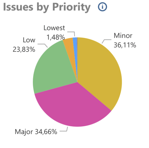
Pie Chart
Pie charts are ubiquitous in data visualization, owing to their intuitive design resembling a circular pie sliced into sections to represent various categories or proportions. Pie charts illustrate part-to-whole comparisons, making it effortless to grasp the relative proportions of different components within a dataset. This visual representation simplifies complex data relationships, enhancing understanding among non-technical audiences.
However, it's important to note that while pie charts are effective for showcasing proportions, they may not be suitable for displaying precise data comparisons or handling datasets with numerous categories. Careful consideration of the data and audience is essential when utilizing pie charts to ensure accurate and meaningful representation.
However, it's important to note that while pie charts are effective for showcasing proportions, they may not be suitable for displaying precise data comparisons or handling datasets with numerous categories. Careful consideration of the data and audience is essential when utilizing pie charts to ensure accurate and meaningful representation.
Line Chart
A line chart, also called a line graph or line plot, is a powerful tool for visualizing trends and changes in data over time. Connecting data points across a continuous period provides valuable insights into the evolution of variables.
One of the primary applications of line charts is tracking price fluctuations in stocks or products, where the x-axis represents time and the y-axis depicts the variable under analysis. It makes it ideal for identifying patterns, trends, and correlations.
Line charts offer several advantages, including ease of interpretation, which makes them a staple in reports and daily analyses. They excel in revealing subtle shifts and nuances within data, enabling analysts to detect emerging trends and patterns efficiently.
However, it's important to exercise caution when interpreting line charts, as they may oversimplify complex relationships or obscure outliers. Additionally, proper labeling and scaling of axes are essential to ensure accurate representation and interpretation of data.
Scatter Plot
A scatter plot is a powerful data visualization tool that enables the visualization of relationships between two continuous variables. In a scatter plot, data points are represented as individual dots, with each dot corresponding to a specific pair of x and y-axis values.
While scatter plots may be more intuitive than other data visualization techniques such as pie, bar, or line charts, they offer several distinct advantages. One of the key benefits is their ability to reveal nonlinear relationships between variables, which may not be apparent in other chart types. Additionally, scatter plots excel at showcasing large quantities of data, making them particularly useful for exploring complex datasets with numerous data points.
Furthermore, scatter plots are well-suited for working with continuous-scale data, allowing for precise visualization and analysis of data points along a continuous scale. Despite their complexity, scatter plots remain fundamental for data exploration and analysis, offering valuable insights into the relationships between variables and facilitating informed decision-making.
Histogram
A histogram provides a comprehensive perspective on data by illustrating the distribution of values through bars. Data analysts segment the data into bins or ranges and calculate the frequency of each range, which is then represented graphically. In a histogram, the x-axis denotes the range of values, while the vertical axis represents the frequency or percentage of occurrences within each range.
Histograms offer valuable insights into the shape of the data distribution, revealing whether it is skewed (left or right), identifying the smallest or largest categories, and highlighting outliers and gaps. It makes them indispensable tools for exploring and understanding the characteristics of a dataset.
Histograms offer valuable insights into the shape of the data distribution, revealing whether it is skewed (left or right), identifying the smallest or largest categories, and highlighting outliers and gaps. It makes them indispensable tools for exploring and understanding the characteristics of a dataset.
Treemaps
Treemaps provide a unique perspective on the part-to-whole relationship within a dataset. Unlike traditional charts, treemaps represent this relationship using nested rectangles, with each rectangle corresponding to a specific category.
Compared to pie charts, treemaps offer a more intuitive visualization of hierarchical data structures, allowing managers to discern patterns and relationships at a glance. Additionally, treemaps are particularly effective for handling large datasets, as they efficiently accommodate and display significant amounts of information within a compact visual layout.
Compared to pie charts, treemaps offer a more intuitive visualization of hierarchical data structures, allowing managers to discern patterns and relationships at a glance. Additionally, treemaps are particularly effective for handling large datasets, as they efficiently accommodate and display significant amounts of information within a compact visual layout.
Heat Maps
Heat maps utilize color-coded data visualization techniques to illustrate the relationships between variables. This unique approach provides a visually striking representation of data, offering insights that may not be immediately apparent through other visualization techniques.
One key advantage of heat maps is their diverse range of applications. They are handy for analyzing user interactions with devices, software, or websites, providing valuable insights into user behavior patterns. Heat maps enable teams to identify critical issues, determine trends, and optimize user experiences by visually highlighting high or low-activity areas.
One key advantage of heat maps is their diverse range of applications. They are handy for analyzing user interactions with devices, software, or websites, providing valuable insights into user behavior patterns. Heat maps enable teams to identify critical issues, determine trends, and optimize user experiences by visually highlighting high or low-activity areas.
Word Clouds
Word clouds offer businesses a powerful data visualization tool for extracting patterns from large text-based datasets. By assigning size and colors to words based on their frequency of occurrence, word clouds provide a visually impactful representation of key themes or topics. They enable users to quickly identify significant or "buzz" words within a dataset, shedding light on prevailing sentiments and overall tone.
In addition to uncovering insights, word clouds also serve as engaging visual aids, capturing the audience's attention and facilitating comprehension of textual information. This combination of visual appeal and analytical depth makes word clouds an invaluable asset for businesses seeking to derive meaning from textual data and communicate findings effectively.
In addition to uncovering insights, word clouds also serve as engaging visual aids, capturing the audience's attention and facilitating comprehension of textual information. This combination of visual appeal and analytical depth makes word clouds an invaluable asset for businesses seeking to derive meaning from textual data and communicate findings effectively.
Maps
Maps are powerful tools for visualizing geographical data, providing analysts with a platform to represent spatial information effectively. Analysts can create dynamic map visualizations that facilitate insights into geographic patterns and trends by leveraging spatial data, also known as geospatial or geographical information.
One of the critical advantages of maps is their ability to simplify the interpretation of spatial data, enabling analysts to identify anomalies and patterns within specific regions or zones. For instance, maps can be utilized to highlight issues such as overpopulation in a country or region, providing stakeholders with valuable insights into localized challenges and opportunities.
Moreover, maps offer a versatile platform for data exploration and communication, allowing analysts to convey complex spatial relationships and findings visually compellingly. This combination of analytical depth and visual appeal makes maps indispensable tools for effectively understanding and addressing geographic phenomena.
Venn Diagram
Venn diagrams employ overlapping circles to illustrate relationships among various elements or data sets. When circles intersect, they represent common traits or attributes shared by the parts they encompass, while areas outside the intersection denote traits unique to each component.
Venn diagrams offer users an exact and intuitive data visualization of relationships, making complex data relationships more accessible and understandable. They serve as valuable decision-making tools for managers, enabling them to identify overlaps, distinctions, and intersections between different categories or concepts.
Furthermore, Venn diagrams can be adapted to represent various relationships, from simple comparisons to complex intersections, making them versatile tools for data analysis and communication.
In addition to the previously mentioned data visualization tools and techniques, you may also find the following ones valuable:
- Gantt chart
- Box and Whisker Plot
- Waterfall chart
- Area chart
- Pictogram chart
- Timeline
Best Data Visualization Tools
Understanding the types of data visualization is a crucial step, but having access to the best data visualization tools is equally essential for confident data analysis work. Here are our top recommendations:
When evaluating data visualization tools, it's essential to consider the following criteria:
- Microsoft Power BI
- Tableau
- Looker Studio
When evaluating data visualization tools, it's essential to consider the following criteria:
- Ease of use.
- Comprehensive documentation and tutorials.
- Ability to handle large datasets efficiently.
- Support for a wide range of charts, maps, and graph types.
- Cost.
Microsoft Power BI - Best for Business Intelligence (BI)
Microsoft Power BI reigns as a top contender in Business Intelligence (BI) tools. With its suite of data visualization capabilities, Power BI empowers businesses to uncover actionable insights and drive informed decision-making. From traditional charts like bar, pie, and line graphs to advanced visualizations like scatter plots, Power BI offers a comprehensive array of visualization types to suit diverse analytical needs. Moreover, its seamless report-sharing functionality facilitates collaboration and knowledge dissemination among stakeholders.
Beyond its visualization prowess, Power BI leverages artificial intelligence (AI) capabilities to enable teams to delve deeper into complex datasets, enhancing analytical capabilities. Furthermore, Power BI supports the creation of datasets from various sources, allowing the establishment of a centralized data repository for visualization and analysis purposes. For instance, leveraging Alpha Serve BI Connectors ensures seamless connectivity between Power BI and platforms like Jira, ServiceNow, Shopify, Zendesk, monday.com, QuickBooks streamlining data integration and analysis processes. Experience the power of enterprise-grade Power BI data connectors with proven scalability, performance, and the highest data security.
Beyond its visualization prowess, Power BI leverages artificial intelligence (AI) capabilities to enable teams to delve deeper into complex datasets, enhancing analytical capabilities. Furthermore, Power BI supports the creation of datasets from various sources, allowing the establishment of a centralized data repository for visualization and analysis purposes. For instance, leveraging Alpha Serve BI Connectors ensures seamless connectivity between Power BI and platforms like Jira, ServiceNow, Shopify, Zendesk, monday.com, QuickBooks streamlining data integration and analysis processes. Experience the power of enterprise-grade Power BI data connectors with proven scalability, performance, and the highest data security.
Tableau - Best for Interactive Charts
Tableau is an upscale data visualization tool renowned for its extensive range of interactive charts. With Tableau, users can seamlessly import data from diverse sources and create dynamic datasets, facilitating comprehensive analysis and insights. Tableau's intuitive interface makes it accessible to many users, including learners, journalists, data analysts, managers, and more. Additionally, Tableau offers a free version, ensuring accessibility for users at all levels of expertise.
Moreover, Alpha Serve offers Tableau Connectors for platforms such as Jira, ServiceNow, monday.com, Zendesk, Shopify. These no-code next-gen connectors streamline data integration processes, allowing users to leverage Tableau's powerful visualization capabilities easily. Experience the versatility of Tableau connectors, enhancing connectivity and enabling seamless data analysis across multiple platforms. Start maximizing your data visualization efforts today.
For an in-depth comparison and understanding of how Power BI stands against another industry giant, Tableau, delve into our comprehensive article "Power BI vs Tableau: Top BI Tools Comparison 2024".
Looker Studio - Best for Visualization Options
Looker Studio, formerly known as Data Studio, is Google's powerful data visualization tool, available for free. It empowers teams to consolidate data into unified reports, quickly creating visually compelling stories. With Looker Studio, you can access over 860 connectors, enabling seamless integration with various data sources. Its intuitive drag-and-drop web-based interface makes report creation a breeze, while an extensive collection of templates simplifies the visualization process.
One notable feature of Looker Studio is its ability to embed reports on any web page or intranet, facilitating seamless sharing and collaboration. Additionally, Alpha Serve offers Looker Studio Connectors for Jira, enhancing data integration capabilities and expanding visualization options. Experience the versatility and power of Looker Studio for your data visualization needs today.
One notable feature of Looker Studio is its ability to embed reports on any web page or intranet, facilitating seamless sharing and collaboration. Additionally, Alpha Serve offers Looker Studio Connectors for Jira, enhancing data integration capabilities and expanding visualization options. Experience the versatility and power of Looker Studio for your data visualization needs today.
Tips for Effective Data Visualization

Focusing on different data visualization techniques and tools won't result in excellence if you don't focus on "effective data visualization." The following tips will help you become a good storyteller while using data visualization techniques in the best possible way.
- Choose the right data visualization type.
- Use color, shapes, and designs.
- Employ text strategically.
- Story-telling through simplicity.
Conclusion
Data visualization is exciting. It opens up hidden stories to target audiences through creative storytelling. All of these are possible via data visualization tools and techniques. You now know about data visualization techniques and tools you can pick for your next data visualization project. Check out our Alpha Serve blog if you’re interested in a similar articles.